-
 My Stable
 -
 Showing
 -
 Advanced Facilities
 -
 Community
 -
 Upgrade
 -
 Resources
X
HGG Community Forums
Log In to HorseGeneticsGame
HGG Community Forums
Join our discord server!
Howdy, Stranger!
It looks like you're new here. If you want to get involved, click one of these buttons!
Categories
- All Discussions61,373
- Announcements1,188
- HAJ Discussion59,030
- ↳ New Member Introductions68
- ↳ Help Me Out5,089
- ↳ Horses for Sale and Auction14,459
- ↳ Breeding Ads and Sales6,079
- ↳ Herd Helpers22,965
- ↳ Bug Discussion7
- Non HAJ Discussion1,155
- ↳ Saddle Sisterhood113
- ↳ Games, Contests and GiveAWays348
- ↳ Genetics305
In this Discussion
- Ammit October 2023
- annismyrph October 2023
- bluchrystals October 2023
- Cavalynn October 2023
- CheshireFarms October 2023
- Fiddler October 2023
- GalwayStallions October 2023
- Herzeloyde October 2023
- Humboldt October 2023
- kgstable October 2023
- MackZ October 2023
- OopsDotCom October 2023
- paradoxphoenix October 2023
- RedtailFoxFarm October 2023
- RKO October 2023
- Starstruck2 October 2023
- WitchwaterAcres October 2023
Need your feedback on the Akhal-Teke art
-


What do you think needs tweaking?
Also is this something that makes you excited for the AT? Is this the BC you hoped for if you voted for them? Thanks!
Need to contact me? Read this first.
I sometimes get busy and miss things. If your private message, question, etc. gets missed please ping me so I can follow up with you. I am also always happy to explain or clarify. (HAJ does not have a customer service email, please send me a forum message! )
she/her
-
I didn't vote for the AK but these look really elegant. Beautiful art.I am Fiddler, my pronouns are she/her
and my game number is 276934 -
Not me checking the forum every day for this lol
The foal is adorable!
I think I would prefer at least the adult to not be ribby. I think ATs can still be very typey without being boney.
I like it, I’d personally just bring the weight of it up a little bit and maybe find another way to convey the type if the art looses it without the ribby-ness. It looks to me like most of the breed these days isn’t kept in boney condition. -
Looking very good! My first impression of them is that they look very Akhal Teke overall. The only thing that immediately jumps out at me is the ears on the adult. They look a little small and oddly attached and I usually notice how large and strongly set AT ears are. As I look at the adult more, I think the position of the head could be a little more extended, like the space between the cheek and the neck a little more open and well-defined. Also, I'm not sure how to describe it, but I notice in a lot of the ref photos that the arch just a little behind the poll is more bent, or maybe that's more so on stallions? As for the ribs showing, I actually like it, but maybe if other players would rather a more muscled sport version the ribs could just be a little less prominent and just lightly indicated by the highlighting and not too much shadows? That way they would show but not give the horse a really boney look overall. As for the foal, it looks to me to have a very "pursed" face like an Arabian foal. I do see that one of the ref photos looks like that, but many of the AT foals look a little softer in the face than that, so maybe just to make the breed characteristics more distinct the AT foal could go in that direction?
Great work! I can't wait to see these in the game. :) -
Not sure what a pursed face or softer in the face means. So you have any examples? Thanks!Need to contact me? Read this first.
I sometimes get busy and miss things. If your private message, question, etc. gets missed please ping me so I can follow up with you. I am also always happy to explain or clarify. (HAJ does not have a customer service email, please send me a forum message! )
she/her -
Sure, I mean a softer expression, with a smoother face and not a lot of details casting harsh shadows, like these photos:


Looking at these ref photos again, maybe a better way to describe the head position and attachment issue I mentioned on the adult is that the ref photos show the throat latch being so prominent that very little to none of the cheek is left as part of the actual profile if you looked at it as a silhouette. The second foal photo particularly shows that, though a little more extreme than some. Also, the first foal shows a good example of the angle at the top of the neck that I mentioned. It looks to me like that angle is because the crest ends there and doesn't curve all the way over the top of the neck into the poll (like a Fjord would have, the other end of that extreme.) Akhal Tekes seem to have almost no crest, so to me the neck looks more angular. -
I love the foal!
I would prefer a little less visible ribs, and a higher head carriage on the adult, I imagine them as very proud looking, almost arrogant/"looking down on you" horses, like the one on @paradoxphenix image.
Will definitely buy and start a new light horse line with akhal-tekes and arabs!Post edited by Herzeloyde at 2023-10-26 14:18:25 -
I agree with the "ribby" look. I know that the Tekes are a very athletic breed being more on the fine boned side, but a less ribby look just seems more appealing and still staying within the body type parameters.Craven Hill - 86081
Galway Stallions - 80319
~ I was formerly ranchmom161 on the forums. -
The more I look at it the more I like it. :D
I still feel the same way about the ribs. Personally, I like the head shape. I agree with the feedback you got on Forest about the chest connection. I think that will go a long way towards the prouder posture Herzeloyde mentioned. I really like that the neck is not ewed. So, personally, I’d like to see that stay in any versions with changed posture. I wouldn’t mind seeing a bit of a “haughtier” appearance like Herzeloyde mentioned because I like that about them too lol
But, over all, I’m sure excited about this one and I’ve been prepping my herd for it. I’m especially excited if it gets shaded as nicely as the Andalusian. :D
These BCs get better and better with each one!
Edit to add what I picture with what I was saying above :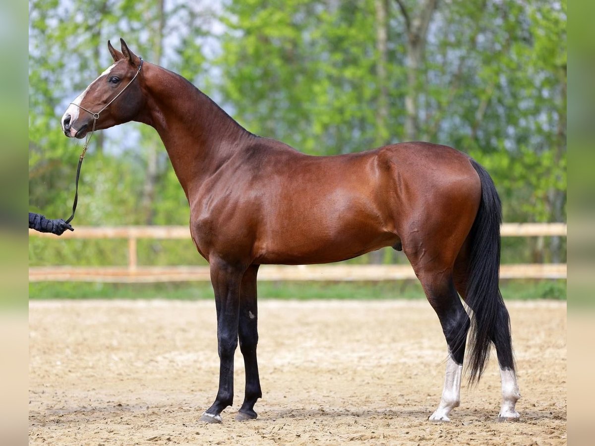 Post edited by paradoxphoenix at 2023-10-26 19:45:21Thanked by 1Ammit
 -
I think the head could be held higher on the adult, with the neck a little more upright and maybe just a tad longer. Personally, I like them lean, and kind of racing-fit!
One thing that might be hard to get across is their hooded eyes, but if there's any way for that to make it into the art, I would be so stoked. It's looking beautiful though! Very excited about this one.Formerly OscarWildin
267111 -

I love the hooded eyes, too! But I agree that they would be difficult to get on the art.
Dragon pony! -
This photo shows a good example of how I think the head and top of the neck could be:

-
Yes, looking at the photos, not all of them are ribby, and look just as good. I dislike the undernourished look of prominent ribs. Perhaps instead of lines like in the art, they were more of shadows and highlights.Post edited by OopsDotCom at 2023-10-26 22:23:01
-
It screams Teke at first glance! Before I provide feed back on the lines, is this a general sketch? Or the proposed line art?
A couple of key things I see right away, is the proportions of the neck and head to the body look off, I can't tell if it's both, or if it's that the head is too large.
The withers are built like a step, instead of a rounded slope. Where they attach to the neck there is a flat that is throwing off the top line. They can have some very pronounced withers, like the picture @Cavalynn posted above. It looks like the withers started off wanting to be pronounced, and then got shy and tapered off quickly.
I don't mind the ribs at all, ribs on a horse is fine and not a sign of emaciation. But I would like to see a fuller hind end on it. The image below looks close to your line art:
It's a little harder to tell with the Palomino in desert lighting, but his hind end is more curved at the top and sloping down the thigh. You'll want to avoid straight and concave lines, which can give the appearance of muscle loss or emaciation. They don't need a Quarter Horse badonkadonk, but it subtle line changes will make a difference.Thanked by 1annismyrph -
I can't wait for this new breed art.#243786
LOST COAST STABLES -
:-? I think I'm in the minority here, but the ones with no ribs showing just look like Warmblood crosses to me. They don't look "Teke". :-??Thanked by 1Cavalynn
-
I also think a little more muscles in the hindquarters would make him even better (the adult)
Can't wait to see them finished (*) -
I think if the ribs are "promintent" on the body it looks very different then just shading of ribs. You can see most of the pictures the horses are super fit, but only shadows of the ribs are showing. If the horse looks "gaunt" with a lot of rib showing I dont find that nice looking at all ( LOL in fact it brings out my Italian "mom" and I want to feed them til they are chubby )Post edited by annismyrph at 2023-10-27 06:20:44

-
Rib feedback is noted. What do people have other than the ribs ;) :DNeed to contact me? Read this first.
I sometimes get busy and miss things. If your private message, question, etc. gets missed please ping me so I can follow up with you. I am also always happy to explain or clarify. (HAJ does not have a customer service email, please send me a forum message! )
she/her -
I think if the head carriage were swapped , it might be a better over all look. AT are really "haughty" looking with their heads up and almost looking " down" on you. That might also give them the look with the eyes being hooded. Most of the foal pictures I have seen are with the head positioned like the adult drawing.
-
Since the ribs were already addressed, I LOVE it otherwise. I think it's elegant!Licenses: Watercolor, Nacre, Splash M, Wrong Warp, Phantom Autumn/Lace/Diamond Sparkle/Web/Hearts/Shamrock/Muddy Puddles/Roses/Critter Tracks/Jellyfish/Birdtracks, Paintbrush Cool, Paintbrush Prism, Plaid, Shatterglass, Inkspot, Toner, Mushroom, DFP2, Onyx, Platinum, Ice 6, Ice 17

-
Looking at it again, I think if you filled out the booty a little more, it would balance the head better. For the most part, your hip and shoulder are going to be equal in size. I think that it what is throwing off the front end looking large.
-
I think the foal is great.
Possible suggestions on the adult (I’m not an expert, so take it with a grain of salt):
- Higher head carriage (more like the foal)
- Slimmer base of the neck
- More pronounced withers and smoother connection to the neck
- Slightly larger/taller ears (and maybe straighter like more vertical?)
Something is slightly off with the proportions of the adult but I can’t quite pinpoint what it is. Maybe the back is a little on the short side? Maybe the legs should be a little longer? The back end just doesn’t seem as prominent as the front end (perspective-wise)
Honestly, a higher head carriage on the adult would probably do it. Like @annismyrph said - the “haughty,” “snooty,” “look-down-on-you” head carriage -
Ammit, forgive me for doodling on your lovely line art here. Disregard if you already have something better going on.
I’m just excited and focusing on this was a great de-stresser for the down time I had in an otherwise crazy work day lol
What I did was:
-Changed head angle
-Made head slightly smaller
-I think I lifted the head a little, too, arguable could have lifted it a touch more
-Altered the through latch
-Changed the neck/chest connection a little
-I did add slightly more wither, although I don’t personally feel it’s necessary.
-Rounded the hind end just a touch
-Took away the ribs lol
This is, of course, just a suggestion and I’m not expecting it to be followed. Just throwing it out there. Something is still not quite right with the neck. LolPost edited by paradoxphoenix at 2023-10-27 16:36:14Thanked by 1annismyrph -
I think the neck needs to be just a touch longer @paradoxphoenix but that drawing looks great , and maybe the chest area smoothed out a little ? They really dont have large "chesticles"
-
Ah! good eye! I forgot to adjust that back after I changed the neck lol
I was thinking length would help the neck, too.
It was fun fooling around with it though! Thank you :DThanked by 1annismyrph -
Hi, my name is paradoxphoenix and I have a problem lol
Basically the same changes as before just refined this time. Same disclaimers. :D This is idea/inspiration/suggestion, and I have no expectations. I just love the BC process lol
I maybe could have left the head a little bigger this time.
-
I am terrible at picking things out in drawings lol but I feel like the neck could be a just little more vertical and maybe slightly leaner. I'm not fussed about the ribs myself as it looks like a very fit Teke and i like that it's distinct from some of the other breeds but I'm sure either way is fine.Starstruck2 on Bluegrass and Forest
Betony707 on Forest & Mesa -
I always prefer people mark up the image as often people make suggestions and I have no idea what they are talking about. :)Need to contact me? Read this first.
I sometimes get busy and miss things. If your private message, question, etc. gets missed please ping me so I can follow up with you. I am also always happy to explain or clarify. (HAJ does not have a customer service email, please send me a forum message! )
she/her -
Yay! I had fun doing it :D
-
@paradoxphoenix I love the most recent one you posted, but I feel like the neck isn’t quite slender enough
Also, I know a lot of people don’t like the ribs, but I feel like with the AT there should be at least gentle shading to show the ribs. With these slender, athletic horse breeds (racing TBs are often like this too) a hint of rib showing is often indicative of a healthy weight for a working horse of these breeds (obviously I’m not meaning any extreme ribs - more like there’s no excess padding over the ribs like with WBs and such) -
I also like the adjustments @paradoxphoenix made, but I would make the neck slightly narrower/more slender, and add light shading to the rib area to show the leanness. The two words that always come to mind for me when thinking of Akhal Tekes are "long" and "lean", especially the more typey ones.
Like others have already mentioned, I think the original art Ammit posted has the ribs just a bit too prominent, but I do agree that they should be showing to some degree.
I might even lengthen the neck and barrel just a touch, and smooth out the lines a bit more. To me, they always look very long and smooth.Might be addicted to pixel ponies...
Licensed for mu, DFP2, SWM, ONX, TMJB, TMSG, PBP, PBC, PBW, VOID, CHN, PLT, DMSP, LACE, JLYF, PDL, ROS, BOU, ATM, WEB, CRT, HRT, SUN, STAR, SHM, all Axioms, all Ices.
ID 276208 -
I agree that the neck could be a bit more slender. Every time I tried to thin it, I lost the shape I was going for :)) :)) :))
-
@MackZ I agree - maybe even make them leggier?
-
@paradoxphoenix you did more than I ever could!Post edited by RedtailFoxFarm at 2023-10-27 20:23:22
-
While breed book images popularize the really thin ribby Akhal Tekes, when you look through pictures of most examples it doesn’t seem like most show ribs. Even the most slender, typey ones.
-
This is kinda what I was referring to rib-wise, maybe a little less
 Post edited by RedtailFoxFarm at 2023-10-27 21:13:31
 -
"I always prefer people mark up the image as often people make suggestions and I have no idea what they are talking about. "
I was always hesitant to do that, because it's not my art work. But if you didn't understand what I suggested above, I could do that tonight when I get home. -
"While breed book images popularize the really thin ribby Akhal Tekes, when you look through pictures of most examples it doesn’t seem like most show ribs. Even the most slender, typey ones."
I really agree with @paradoxphoenix
I think the misunderstanding that Akhal-Tekes should be super skinny and thin stems from the time when the breed started to get attention again from foreigners around the fall of the Soviet Union, when there was chaos and huge poverty/hunger. If you see videos on Youtube of Akhal-Tekes in Turkmenistan today, you see elegant and super fit horses with refined lines, but not skinny horses.
This head carriage, high and proud, but without a ewe neck would be incredible if it is possible to draw. I really like this one
https://www.huntandjump.com/forum/discussion/comment/424427#Comment_424427
-
Reminder folks:
"Rib feedback is noted. What do people have other than the ribs? "Need to contact me? Read this first.
I sometimes get busy and miss things. If your private message, question, etc. gets missed please ping me so I can follow up with you. I am also always happy to explain or clarify. (HAJ does not have a customer service email, please send me a forum message! )
she/her -
If it is possible, I would love a more high and proud head carriage.
Something in this style, without a ewe neck would be incredible if it is possible to draw. I really like this one
https://www.huntandjump.com/forum/discussion/comment/424427#Comment_424427 -
The look of the gold Palomino AT is what I think of when I think on the breed. Rib shading would be fine since most race type horses show a race weight while they are working and AT are used on the flat (race track) where they come from. I also love the look of the buckskin filly too - so elegant. The black foal is amazing too, although technically his color is brown, dark bay or seal brown, one of my favorite coat colors for a horse.Post edited by RKO at 2023-10-28 17:22:55Bluegrass id:182429
Forest id: 289
Mesa id: 351 home of the Katbianloosa, Katlineers Cob, Katlusian, Katalouse, KatriesianRID and Katroughbred -


Black lines with corrections made
So I didn't want to completely scribble all over, because then I'd be making it my art, and taking away from Jinx's style. But I did make a couple of stroke corrections to some of the body, as well as shrink the head and neck slightly.
The head carriage is actually a natural set for a Teke. Those high heads that people see are not in their relaxed state.Post edited by CheshireFarms at 2023-10-28 22:44:14 -
Edit: I think I fixed the photos and added links to where they came from.
I found a few more pictures to point out the shape of the neck and throat. The topline of the neck should be a little more angular, and as CheshireFarms says the throat latch should be curved, so the cheek is almost smoothed over in profile. The very top of the throat where it's attaching under the head should almost be a wider point to the neck than just before. Also, looking at more photos, I think maybe the cannon bones could be shorter, especially the back ones.

I particularly like the neck and withers and barrel in this photo:
This shows a good neck shape too:
This is also a good example and a better overall ref image:
Source webpages:
http://www.karakumstud.com/web/karakum.nsf/PermaLinks/TNKH-733QM6
http://www.karakumstud.com/web/karakum.nsf/PermaLinks/TKEH-76YV8Q
http://www.karakumstud.com/web/karakum.nsf/permalinks/TKEH-6G5H6XPost edited by Cavalynn at 2023-10-29 10:11:45Thanked by 1Ammit -
All your photo links are bad :(Need to contact me? Read this first.
I sometimes get busy and miss things. If your private message, question, etc. gets missed please ping me so I can follow up with you. I am also always happy to explain or clarify. (HAJ does not have a customer service email, please send me a forum message! )
she/her -
Thanks, everyone for the feedback. There is a TON of conflicting posts here so it is going to take us a while to comb through it all and figure out which feedback we want to implement. I am going to close the thread here for our own sanity.Need to contact me? Read this first.
I sometimes get busy and miss things. If your private message, question, etc. gets missed please ping me so I can follow up with you. I am also always happy to explain or clarify. (HAJ does not have a customer service email, please send me a forum message! )
she/her


This discussion has been closed.
All Discussions Join our discord server!
8/15/2025 5:30 AM EST
SWITCH UP! It's the 15th and Random Gene Sale switch has activated. Until the 1st of the month you can now pick up:
Dense Pheomelanin

White 15

Chocolate

Rainbow Riot Paintbrush Warm

Pangare Plus

Phantom Sun Runes

Phantom Star Runes

Dense Pheomelanin
White 15
Chocolate
Rainbow Riot Paintbrush Warm
Pangare Plus
Phantom Sun Runes
Phantom Star Runes
8/3/2025 9:16 AM EST
Enlarge Your Pastures
You can now use GTs to enlarge your pastures, all the way up to 200 mares! Pasture sizes have also been standardized.8/1/2025 5:30 AM EST
SWITCH UP! It's the 1st and Random Gene Sale switch has activated. Until the 15th of the month you can now pick up:
Tiger Eye 2

Rainbow Riot Paintbrush Prism

Sunshine

Phantom Sun Runes
Phantom Star Runes
Gray Reduction

PDR Belton Spotting

Tiger Eye 2
Rainbow Riot Paintbrush Prism
Sunshine
Phantom Sun Runes
Phantom Star Runes
Gray Reduction
PDR Belton Spotting
7/30/2025 1:13 AM EST
Reminders!
7/25/2025 10:00 AM EST
Vacation GT Sale!
The HGG team is on vacation until Wednesday so I have put all golden tokens 10% off for the duration of our break. Enjoy!
0%